Phoenix Orange
#FF6A00Primary CTA, logo flame, active states
Bold, automotive, high-contrast, and practical. The brand should feel fast and premium without losing quote clarity.

Use orange and red for energy, graphite black for the premium automotive base, and silver or white to keep the system readable.
Primary CTA, logo flame, active states
Gradients, urgency accents, hover states
Small highlights, flame tips, badges
Logo chrome, borders, secondary details
Header, footer, panels, strongest contrast
Body backgrounds and reversed text
WRAPS THAT GET SEEN
Clear quote copy, service details, and trust-building proof points should stay easy to scan.
WebP files are optimized for the site. PNG files are included for handoff, presentations, email signatures, and vendor uploads.
Use on dark or high-contrast placements with enough width for the car and tagline.
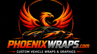
Best default for the website header and footer.
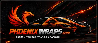
Use on black, charcoal, or image backgrounds.
Use where the full wordmark would be too small.
Use over orange, red, or photo backgrounds.

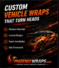
Use for social headers, lead-gen ads, and alternate hero treatments.
Keep CTA text readable and do not crop the logo.
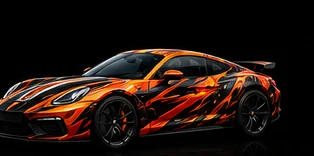
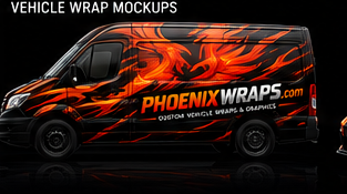
Use as concept art, not final production wrap artwork.

Useful for commercial wrap pages and ads.
Use as a starting visual direction for print collateral.
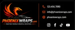
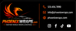
Use below sales replies and quote follow-ups.
Use these sparingly behind dark sections, quote cards, ads, or campaign panels. Keep text on solid overlays.


Use RGB exports for web and screen assets.
Use CMYK exports and 300 DPI minimum for print collateral.
Request vector redraws before final production vehicle-wrap printing.
Keep dark backgrounds near #0A0A0A for strongest logo contrast.
Use orange/red gradient CTAs for primary quote actions.